Big data / small data
There’s a lot of hype around about data. ‘Big data’ in particular is talked up as the source of new insights in research and business. But what is the ‘data’ that we’re interested in as humanities researchers and cultural heritage workers? Miriam Posner’s article explores some of the complexities of ‘data’ from a humanities perspective. She notes that humanities researchers are:
not generally creating data through experimentation or observation — more often than not, we’re mining data from historical documents. You name it, we’ve tried to mine it, from whaling logs to menus to telephone directories.
Rather than working with the outputs of machines, we’re usually working with artefacts created by people which, as Miriam notes are often ‘eccentric, disparate, and historically and geographically uneven’. Nonetheless, working with this information in a digital environment allows us to do and see things differently. I wrote a bit about this in ‘“A map and some pins”: Open data and unlimited horizons’.
In Exploring Big Historical Data, Shawn Graham, Ian Milligan, and Scott Weingart explore what ‘big data’ means for historians – ‘the joys of abundance but also the dangers of information overload’ (p. 4). What impact do the vast quantities of data becoming available have on our ability to understand and interpret the past?
Portfolio alert! Read the resources linked above and reflect on the changing meaning, scale, opportunities, and challenges of data in the cultural heritage sector. Write a job advertisement (minimum of 250 words) for a Big Historical Data Analyst describing the position’s aims, responsibilities and required skills.
Exploring data repositories
The federal and most of the state governments maintain portals to help you find government datasets. This includes an increasing amount of data from cultural heritage organisations. Here’s the ones I know about:
- data.gov.au – it’s the federal portal, but it also contains some data from state institutions, such as LINCTasmania
- data.act.gov.au
- data.nsw.gov.au
- data.qld.gov.au
- Data.SA
- data.vic.gov.au
- data.wa.gov.au
- data.tas.gov.au
Have a poke around on these sites to see what you can find. If you’re not sure where to start, try searching for things like ‘archives’, ‘history’, ‘heritage’, or ‘library’. Here’s a few examples:
- Tasmanian Inquests (1828-1930)
- Consumptive patients 1897 to 1902 (Queensland)
- Portraits and people from the National Portrait Gallery
Note that the first two of these are available as CSV (Comma Separated Values) files. CSV files are like spreadsheets and can be easily opened and used in tools like Excel, or many of the web services we’ll be playing with in future modules. The ‘Portraits and people’ data is available as an XML (Extensible Markup Language) file. XML enables you to represent hierarchies within your data, so you can have more complex structures than in a flat CSV file. Many of the tools we’ll be looking at can also use XML.
WTFCSV
If you have a CSV file, but you’re not sure what to make of it, WTFCSV is a fun little tool that can provide some useful insights.
- Follow the Tasmanian Inquests link mentioned above, and download the CSV file by clicking on Explore and selecting ‘Go to resource’.
- Go to WTFCSV, click the ‘upload a file’ tab, and then again on the ‘upload a file’ link.
- Find and select the
inquests.csvfile you just downloaded. - Click ANALYZE to upload and process the file.
WTFCSV analyses the data in each of the columns of the CSV file and tries to work out what kind of data it is – is it made up of dates, numbers, or text? It then creates some simple visualisations to give you a preview of the data and the range of values that each column contains. It’s far from perfect, and you wouldn’t use it to make serious arguments, but it provides a useful first look at an unknown data set.
Once the inquests have has finished loading, explore the results. Note that you can get more information about each column by clicking on the i in the corner of each box. See if you can find the answers to the following questions:
- What sort of information has been recorded in the
REMARKScolumn? - How many inquests returned a verdict of ‘Found drowned’?
- Over what period were most of these inquests held?
Portfolio alert! Add the answers to the questions above to your portfolio.
Understanding APIs
There are many ways to package and deliver data, but some are easier to use than others. Think about the difference between a table of data in a PDF file and that same data in a CSV file. PDFs are nicely formatted so that they can be easily read – by humans. CSVs, on the other hand, stick to a very limited set of formatting conventions that make it hard for humans to read, but great for computers. Any computer program can open a CSV file and know that there’ll be on record per line, with individual fields separated by commas. Knowing that, computers can manipulate the data in all sorts of ways. A CSV is an example of what’s called ‘machine-readable’ data.
CSVs are really easy to download and use, but they have their limitations. What if you only want a slice of the data? You have to download the whole thing and then extract that slice. What do you do if the data changes frequently?
An API (Application Programming Interface) defines a set of instructions that computers can use to get data from each other. They deliver data in a machine-readable form, but only as it’s required. So instead of getting everything at once, you get what you ask for, packaged up in convenient chunks. Humans use websites to get the information they want, computers use APIs.
APIs connect up a lot of the things you do online. Whenever you use an app to access a service like Facebook or Twitter, you’re using APIs provided by those services. APIs expose data in a way that makes it possible for people to build new tools or interfaces.
Remember QueryPic? How do you think it got its data from Trove? Yep, Trove has its very own API. Every chart in QueryPic is built up from multiple requests for data via the API. I’ve used the Trove API in lots of tools and projects such as Headline Roulette and the Trove Newspaper Harvester.
To make use of an API you generally need some coding experience, but not always. Yvonne Perkins has written a great tutorial to show how you can use Excel to harvest newspaper articles from Trove using its API. My DIY exhibitions and headline roulette also allow you to make use of the Trove API without any coding.
To understand how the Trove API works, play around with my Trove API Console. Just click on a few of the examples and see what happens. Look for ‘q=’ in the query box and try changing the value that comes after it. Don’t worry – you can’t break anything!
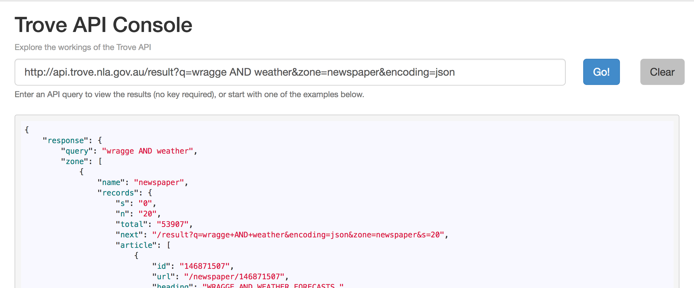
Using the API Console’s example queries, find out how you can limit results to a particular year. Then construct an API query that will find newspaper articles from 1901 that include the phrase</> ‘White Australia Policy’.
Portfolio alert! Copy the API query (the url in the query box) into your portfolio.
The Trove Help Centre provides more information about the API, including a number of examples and experiments.
Scraping data
Sometimes the data you want isn’t available in a convenient form like CSVs or APIs. But if it’s on a web page, you might be able to extract it using a process called screen scraping. Remember how X-Ray Goggles showed you the structures underlying web pages. Screen scraping uses those structures to indentify the bits of data you want on a web page – once you’ve identified them, they can be extracted and saved in a nice structured format, such as a CSV file.
I’ve spent a lot of time screen scraping data from sources such as the National Archives of Australia (here’s 70gb worth of ASIO files for example). The images and data that we’re using for our transcription project were all screen scraped from the National Archives’ online database using my RecordSearch tools and harvester. It can be a frustrating process, but sometimes it’s the only way to get your hands on useful data.
Planning Alerts is a site that gathers information on planning applications from local governments, and automatically sends you alerts about developments in your neighbourhood. Most of the data it uses is scraped from local government websites. These scrapers, and many others, are hosted on Morph.io. This service turns lots of little custom screen scrapers into a convenient data repository. It’s sort of like a guerilla version of the official ‘data.gov’ repositories – opening up data for reuse and analysis.
There are also a growing assortment of tools that make screen scraping much less painful. For example, you might like to have a play around with Import.io, which provides a point and click interface that you can use to web pages into datasets and APIs.
Cleaning data
As we noted, cultural heritage data can often be messy and inconsistent. That just comes with the territory. We’ve already seen how much variation there is in the formatting of things like dates amongst the White Australia records. The process of taking data and imposing some sort of consistency in formatting, spelling, and terminology is called normalisation. Normalisation is crucial for many forms of digital analysis – how can we put events on a timeline if all the dates are in a different format? But we also have to be aware of what we might lose in the normalisation process. Variations and inconsistencies can provide evidence of human processes at work – traces of meaning and history. We should always keep track of the changes that we make and reflect on their possible impact.
Cleaning up messy data can be pretty painful, but a tool called OpenRefine makes it much easier. I suspect we’ll be making significant use of OpenRefine when we start processing our transcribed data, so it’s worth spending some time getting to know what it can do. Here’s a video introduction (and yes, it was originall called Google Refine, but Google handed it over to the community for continued development):
If you’d like to learn some more advanced techniques for transforming data, see this video.
Intersect have prepared a useful tutorial to introduce you to the power of OpenRefine. In particular, its ability to cluster variations in spelling and standardise them all with a single click is just like magic. It can save you many hours of painstaking manual work.
To use OpenRefine you’ll need to download and install it. Use the latest version ‘2.7’.
Once you have it installed work through the tutorial. Try to at least complete up to section 7. If you’re feeling adventurous, go on to try some geocoding in section 8.
Portfolio alert! Once you’ve finished the tutorial export your cleaned-up dataset as a CSV file (see section 10) and attach it as an appendix to your portfolio.