Treating text as data
In the last module we explored some of the varieties of humanities data – from spreadsheets to faces. But one of the main sources of data humanities researchers work with is rather more familiar – text. Words can be counted, patterns identified, and concepts extracted.
We’ve already met one example of treating texts as data – my QueryPic tool. As you know, QueryPic visualises searches in Trove’s digitised newspapers. But to be honest, it’s not really analysing the contents of the newspapers directly. Instead it’s relying on Trove’s built-in search index. QueryPic shows you the number of articles per year containing a particular word or phrase. It doesn’t show you the number of times that word or phrase occurred in all those articles. As I warned – these sorts of visualisations aren’t arguments or proof, you need to remain sceptical.
Have a look at this QueryPic that explores when the Great War became World War I. Naturally enough, it shows that we only started talking about World War I sometime after World War II had started. Makes sense! However, if you hover over 1916 on the World War I line, you’ll see there are 108 matching newspaper articles. What’s going on? Is this evidence of time travel?
Click on the point to load results from Trove. Click on one of the results. Notice any references to ‘World War I’? Have a look at the user tags. You might find the odd OCR error, but most of those articles are there because some helpful Trove user has tagged them with ‘World War I’ and Trove helpfully searches user tags and comments along with the text!
In all of the tools and examples we’ll be looking at in this module, remember to be sceptical, ask critical questions, don’t just accept what you’re given because it’s presented in an attractive and interesting way!
While QueryPic doesn’t let you explore the number of times words are used within articles, other tools such as Google’s Ngram viewer do.
What’s an n-gram? It’s a term from linguistics which usually refers to a series of consecutive words from a text, where ‘n’ represents the number of words. A single word is a 1-gram or unigram, a two word phrase is a 2-gram or bigram, three words gives you a trigram.
Google’s Ngram viewer has taken the content of millions of scanned books and split them up into 1, 2, 3, 4, and 5 grams. You can search on these words or phrases and view a visualisation of their frequency over time – much like QueryPic.
Try typing a few words or phrases and see what you can find. You can change the corpus (the collection of texts that are being searched) from the dropdown list – what difference does this make to your search?
One thing you might notice is that the Ngram viewer is case-sensitive. This may seem a bit annoying, but it allows you to look at interesting things like the usage of ‘aborigines’ versus ‘Aborigines’. When does the change in usage seem to take place? Can you think of any similar shifts in language you could test?
Portfolio alert! Repeat the searches you used to create your QueryPic chart in the ngram viewer. Try changing the corpus used and the capitalisation of your terms. In a minimum of 100 words describe the differences you observe.
There are also a lot of advanced options that you can use, such as searching by parts of speech. But yet again – DON’T TRUST WHAT YOU SEE!
Do what everyone does when playing around with something like this – search for rude words. In particular, search for ‘fuck’ from 1600 to 2000. It seems writers were much more liberal in their use of the f-word up until the beginning of the 19th century. It then almost disappeared until the second half of the twentieth century. But what are we actually seeing here? Read this article to find out.
People have pointed out a number of problems with the Ngram viewer – such as OCR quality and bad metadata. Just like QueryPic you have to remain sceptical of the results it offers – it’s an interesting place to start an investigation, but it doesn’t give you all the answers.
You might also like to play around with Bookworm, a tool that developed from the n-gram viewer. It’s been applied to a whole range of text collections including movie scripts and the Simpsons. Ben Schmidt, one of the Bookworm developers, has also used the Google ngram corpus to analyse the language of period TV dramas for ‘prochronisms’ – words that are historically out of place.
Counting words
One way of analysing individual books or documents is by just treating them as a ‘bag of words’ – don’t worry too much about meanings or structures, just break them up into words and start counting the results. Strangely enough this often produces useful insights.
The Museum of Australian Democracy has a fun site that allows you to do some basic frequency analysis of election speeches. Try searching for a few terms or try their potted examples.
-
Who made the longest election speech?
-
Who is the only leader to have given a speech that was understandable to a 7th grader?
Portfolio alert! Save the answers to the questions above in your portfolio.
One great thing about this site is that they provide all of their texts for others to analyse! Click on the Download button near the bottom of the page to save a copy of all the speeches for later.
While we’re at it, let’s download some more political speeches. Last year I havested 20,000 transcripts of speeches, interviews and press releases from Prime Ministers since World War 2. The transcripts are all searchable on the PM Transcripts site, but I thought it would be useful to make them available in bulk through my own repository. I’ve also aggregated the transcripts by PM. Let’s download the combined speeches of Julia Gillard. (If the file opens in the browser rather than downloading, just use File > Save Page As to save it to your computer.)
Databasic.io provide a simple tool called WordCounter for, you guessed it, counting words. It’s not terribly robust or configurable, but it’s a fun first attempt at dipping into the bag of words.
-
Go to WordCounter and click on upload a file.
-
Choose the Julia Gillard file you just downloaded and click on Count.
-
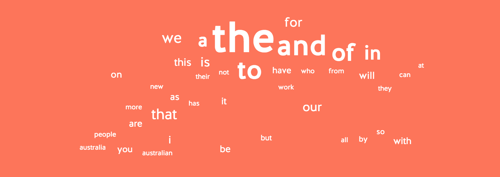
A word cloud will load, as well as a list of the most frequent words, bigrams, and trigrams. What can you see?
Ok, so it’s not very interesting or surprising that ‘Australia’ and ‘people’ figure prominently, but it’s notable that ‘work’ is the next most frequent word. In the trigrams we see the continuing importance of ‘the united states’ and perhaps an indication of PM Gillard’s rhetorical orientation in the frequent use of ‘for the future’.
The main problem with this simple tool is that there’s no way of hiding words like ‘Australia’ to reveal possibly more interesting patterns. The tool has filtered out many common words like ‘the’ and ‘and’ (these are known as ‘stop words’), but there’s no way of adding to this list of stop words.
If you want to test the impact of stop words, try loading the speeches again, but this time uncheck the ignore stop words box.
Looking deeper with Voyant
Voyant Tools is a powerful text analysis suite freely-available over the web. It provides a lot more options than the simple tools we’ve seen so far. Let’s have another look at Julia Gillard.
-
Go to Voyant Tools and paste the following url into the box
https://github.com/wragge/pm-transcripts/raw/master/pms/gillard-julia-speech.txt. Click Reveal. -
The Voyant dashboard will open with information about the most frequent words. But this is just the beginning.
Voyant is a great tool, but it can be a bit flaky at times. If the interface stops responding or behaves strangely just try reloading the page.
On the dashboard you’ll see a familiar looking word cloud. As in the WordCounter , ‘australia’ and ‘people’ dominate – but in Voyant we can change this.
-
Hover on the header bar above the word cloud – a series of icons will appear. Move your cursor over them to find the one that says ‘Define options for this tool’ and click on it. The Options box will open.
-
Look for the Stopwords setting and click on Edit List. A list of the most common stop words will open.
-
Hit return to move to a new line and type in ‘australia’.
-
Do the same for some of the other most common words such as ‘australians’, ‘australian’, and ‘people’. Click Save and then Confirm to apply your changes. What happens to the word cloud?
But did we really want to get rid of ‘people’? Just because it’s very common, doesn’t mean that it’s not interesting. In an analysis of gendered language we might want to compare use of ‘people’ and ‘men’ for example. Or we might want to compare against words like ‘citizens’. Once again, the choices we make to exclude or include can make a big difference to the patterns we see.
-
Feel free to add more terms to the stop words list. Once you’re happy with the word cloud, hover over the header bar again and click on the ‘Export a url’ icon.
-
Click Export to open your word cloud in its very own tab.
-
Try adjusting the Terms slider in the bottom left-hand corner. What happens?
Try playing around with some of the other tools. My current favourite is Bubble Lines!
Comparing texts
So we can use text analysis tools to explore a single document, but what about comparing multiple texts?
Once again, Databasic.io offers a simple tools to get us started. This one’s called SameDiff.
-
If you haven’t already, unzip the file of election speeches we downloaded from MoAD.
-
Open up SameDiff and click on upload files.
-
Select two of the files from the election speeches folder and click Compare.
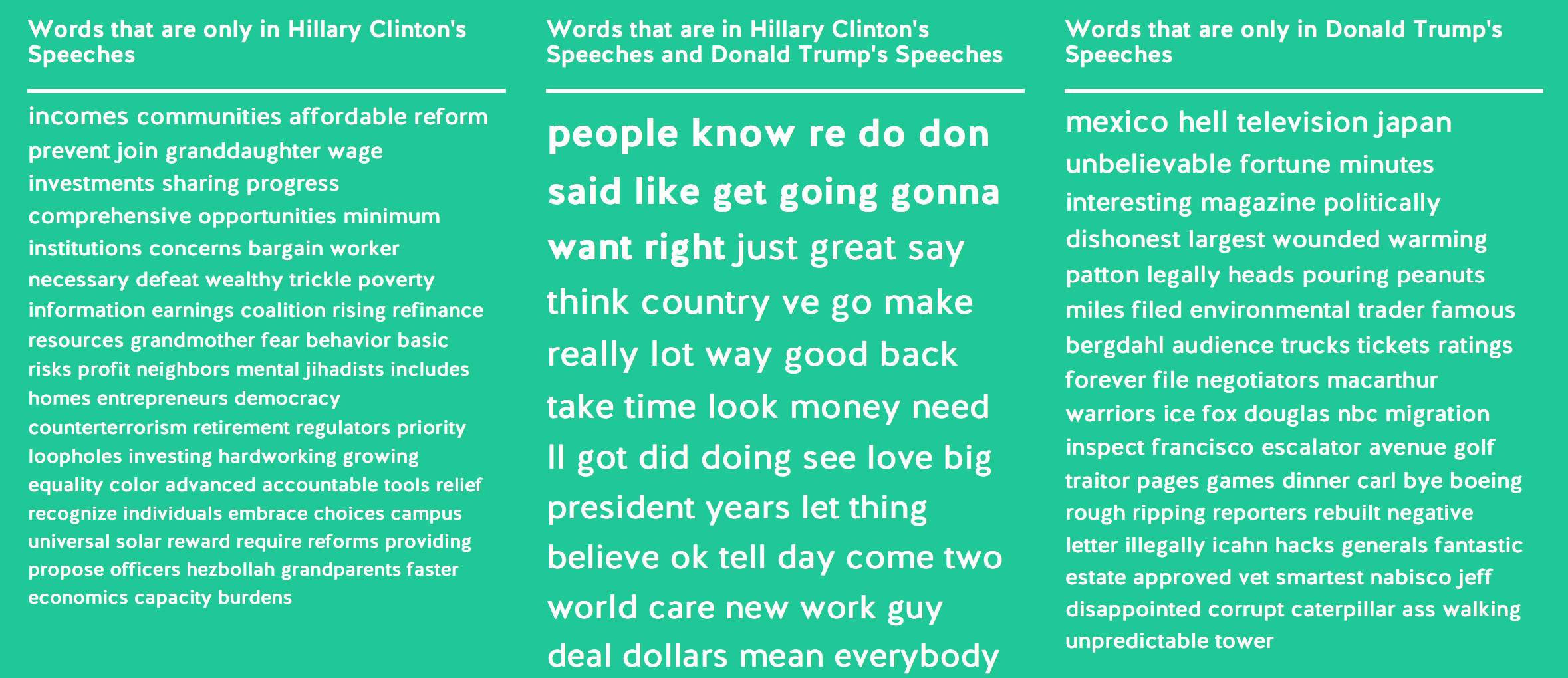
Note that at the top of the page you’ll see a ‘cosine similarity score’ that gives you an indication of the similarity of the language in the two files based on word frequencies.
Underneath you’ll see word clouds displaying the words that both documents have in common, as well as those that are only in one of the documents.
-
Let’s compare the speeches by Malcolm Turnbull and Bill Shorten from the recent election. Despite their political differences, these speeches are ‘kind of similar’ with a score of 0.61.
-
Now lets’s compare the earliest speech, by Edmund Barton, and the latest, by Malcolm Turnbull. These speeches are ‘completely different’ with a similarity score of just 0.19.
Unsurprising it seems that time has more of an impact on language than does political allegiance. But one thing that struck me in the Barton-Turnbull comparison is that the word ‘Australians’ only appears in Turnbull’s speech. Really? How was Barton addressing the people of Australia? That seems like something worth exploring further.
Let’s head back to Voyant to dig a bit deeper.
-
Open Voyant as before. Another cool thing about Voyant is that it can process a variety of different file types – even PDFs. In this case we can just upload the whole zip file of MoAD’s election speeches and it will unpack it and process the individual files.
-
Paste the following url into the box
https://dl.dropbox.com/s/8bjgf5i38i5yu4t/moad-election-speeches.zipand click Reveal.
You’ll see that some things about the dashboard are a bit different. In particular, the summary pane in the bottom left-hand corner provides some useful comparative data. Look at the list of ‘Distinctive words’. These are words that are frequent in an individual speech, but much less so across the whole collection.
-
Go to the ‘Trends’ panel in the upper-right corner and open it in a new tab as you did with the word cloud earlier.
-
Type ‘australians’ in the input box and hit enter. We can now see how frequently the word ‘australians’ appears across the whole collection.
-
Mouseover the points on the graph to see which speeches contain the most/least references to ‘australians’. Do you notice anything interesting.
It seems that, in general, recent speeches talk more about ‘Australians’. I only just noticed this while preparing this lesson and I’m now quite intrigued. This is what happens when you start exploring texts!
The corpus view only gives a taste of the many tools and visualisations that Voyant provides. To try out some others just:
-
Hover over the blue bar at the top of the screen and click on the icon that looks like a window.
-
A menu of available tools will appear. Have a play! See what you can find.
Some of the tools are easier to understand than others. For example, ‘Contexts’ (under Document Tools) simply displays a selected word in the various contexts in which it appears throughout the corpus.
-
Select ‘Contexts’ from the Document Tools menu.
-
Type ‘immigration’ in the input box, wait for a minute while Voyant checks to see the term exists, and then click on the term ‘immigration*’ in the results list.
-
Browse the list (you can resize the columns if necessary). Double click on an entry to see even more context!
The creators of Voyant Tools have made it really easy to embed their tools in your own website – so you can include the visualisations alongside your analysis. Any of the available tools or visualisations can be viewed in its own window, embedded, and shared.
Let’s make a Streamgraph and create a shareable link.
-
Select the tools menu as before and click on ‘StreamGraph’ under ‘Visualisation Tools’.
-
Remove the current terms by clicking on them at the top of the screen.
-
Add new terms by typing them into the input box at the bottom of the screen and selecting the results that pop up.
-
Because the speeches are arranged in chronological order, the streamgraph will show you changing frequency across time. What interesting comparisons can you create?
Once you’ve created something that looks interesting, let’s get a shareable link.
-
Hover over the grey StreamGraph title bar and click on the icon that looks like an external link.
-
The ‘Export’ dialogue appears. By default the ‘URL’ box is checked, but you can also choose ‘Export view’ to get the code to embed your visualisation in a web page, or ‘Export Visualisation’ to download an image.
-
Click Export and a new window will open with your StreamGraph and a shareable url. Share it on Slack!
Portfolio alert! Grab a screenshot of your streamgraph and save it and the url to your portfolio.
Here’s an example of how you can incorporate Voyant visualisations into any old web page using the embed codes. You’ll see that the StreamGraph below is not just an image, it’s live! You can add or subtract terms here, without ever going to Voyant.
There’s all sorts of clever things you can do with Voyant to make use of it in your own site. For example, I’ve built it in to my Historic Hansard site – just click on a link to automatically open a year of Hansard in Voyant. Check out the ‘Embedding Voyant Tools’ page in the help documentation for more possibilities.
Overviewing with Overview
Another useful tool for comparing texts is Overview. This tool was developed primarily for use by journalists trying to make sense of large collections of documents (such as some of the recent ‘leaks’). It offers a powerful way of exploring clusters of similar documents.
Here’s a video that teaches you Overview in 90 seconds!
Learn Overview in 90 seconds from Jonathan Stray on Vimeo.
-
Go to Overview and sign up for an account.
-
Once your verified and logged in, click on the Upload files link from your dashboard.
-
Click on Add all files in a folder and select the unzipped folder of election speeches.
-
Click Done adding files and wait… It can take a while to upload and process the documents.
Once it’s done, you document set will open with yet another word cloud. Yay! But it’s really the ‘tree’ view that is most interesting.
-
Click on the Add view tab and select ‘Tree’.
-
Give your tree a name and then click on the Create Tree button.
-
The tree view starts with a box representing all of the documents, and provides examples of some words that are common across the collection. As you move down the tree you’ll see it subdivides the collection into clusters based on the similarity of their language.
-
Click on the plus sign on one of the boxes in the bottom row. You can keep going through increasingly narrow clusters until you get to a single document.
-
What is similar about the documents? Try clicking on the big box in the second row. You’ll see the list of documents on the right hand side updates to include only those in the selected cluster.
-
Scan the list of documents in the selected cluster.
-
Now select the smaller box in the second row and scan the results. Can you see any interesting differences between the two clusters?
Once again it seems that time plays a big factor in the nature of our political language. The two clusters on the second row break down remarkably cleanly along temporal lines. The big cluster is pre-1980, the little one is post 1990, and the 1980s appear in both. What happened to our political language in the 1980s? Another question to explore at a later date!
Overview bases its similarity measures on a statistical measure called TF-IDF (Term Frequency / Inverse Document Frequency). Instead of just telling you how many times a word appears in a document, TF-IDF tells you how many times a word appears in one single document compared to a whole collection of documents. This gives us a measure of that word’s significance within the context of that document. A word that appears many times in a single document, but only rarely across a collection, will receive a high TF-IDF value – it’s a marker of what’s different about that document.
I use TF-IDF quite a lot in my own work as a way of getting an understanding of what makes a document different from its peers. For example, In a word takes descriptions from current affairs programs broadcast on ABCRN and extracts the word with the highest TF-IDF value for each month and program. The result is a word that gives us a sense of what was ‘different’ about that month (at least according to the ABC). There’s more documentation about how I created it at the bottom of the page.
Here’s a couple of other things I made using TF-IDF:
-
Word clouds created using the top 200 TF-IDF weighted words for each decade in Hansard – the bigger the word, the higher its TF-IDF value.
Portfolio alert! Look at the two examples above carefully and think about how TF-IDF values are calculated. Can you find any interesting patterns in the speeches? Write a minimum of 100 words on what you notice. Then look at the Hansard word clouds – a lot of the high-value words seem unfamiliar. Why do you think that is? You might notice ‘Corinella’ in the first cloud – trying searching for it in Historic Hansard. Can you work out why it has a high TF-IDF value in the period 1901-1910? Explain your theory in a minimum of 100 words.
Another way of looking for clusters within collections of documents is a technique known as topic modelling. See this tutorial on the Programming Historian site for an introduction.
Extracting information
Let’s go back to Overview to see how we can extract additional information from texts.
-
Click on the Add View and click ‘Entities’.
-
You’ll see a list of names and places extracted from the speeches.
-
Check the ‘Geonames: countries’ box on the left hand side to limit the list to country names.
Just like that we have a list of the countries mentioned most often in Australian election speeches. Can you see anything interesting? Once again the influence of the USA seems prominent.
Overview uses a technique known as Named Entity Extraction (NER) to look for names of things within a text. NER is built into lots of different tools – it can be a bit hit and miss, as you’ll see when you scroll through the list, but it’s also pretty powerful. There’s even a Named Entity Extraction plugin for Open Refine.