Visualising data
Where to start? Data visualisation is a popular topic at the moment and there’s a rapidly growing number of guides, tools, and examples. It’s all a bit overwhelming. Rather than get too bogged down in the possibilities, I thought I’d just look at a few basic types of chart and how you can create them. But you should explore further using the resources listed below.
This video provides a good starting point:
We’ve seen a number of types of visualisation already. For example:
- QueryPic and the Ngram viewer
- MoAD’s Election Speeches
- Word clouds in Voyant
In this module we’ll be working with what we conventionally think of as ‘data’ – numbers in spreadsheets. But in the next module, we’ll look at other ways of mobilising cultural heritage resources, such as in maps and stories. There’s no one approach to visualisation in cultural heritage!
Guides and catalogues
How do you tell a bar chart from a histogram? (That’s one that I have trouble with…) The first challenge in working with data visualisations is just understanding the basic language, styles, and conventions. A Tour Through the Visualization Zoo provides an overview of the main categories of data visualisation and how they’re used.
For a more detailed list of visualisation types have a look at the Dataviz Catalogue. It has good, concise descriptions of each type and a list of tools you can use to create them (although it doesn’t include Plot.ly for some reason). In a similar way, the Periodic table of visualisation methods gives a conceptual overview of how the different types of data visualisation are used.
But how do you choose? How to design an excellent chart provides a useful step-by-step guide. Alternatively you can jump straight to Choosing a chart – a simple visualisation of visualisation options, that helps you choose a chart type based on your data and what you want to show.
Looking critically
One of the continuing themes throughout the unit so far is that you can’t trust what you see. Collections themselves are culturally constituted with significant gaps and silences. Search engines distort our experience. And visualisations don’t show the ‘truth’, they argue a case.
A good way to start an exploration of data visualisation is to critically examine a few examples.
The list below presents a number of different types of visualisation.
- Kindred Britain
- The Preservation of Favoured Traces
- Mapping the Republic of Letters
- Mapping Police Violence
- The Institutional Harvest
- A timeline of Earth’s average temperature (xkcd)
Examine them closely and consider the following questions:
- What is the data that’s being presented?
- How easy is it to understand what you’re seeing?
- What did you learn from it?
- What might be hidden or missing?
Portfolio alert! Choose two of the visualisations above and in a minimum of 400 words try to answer the questions above. Be thoughtful and critical – question what you see.
Which visualisations do you like? Which are most effective? Different visualisations will appeal to different audiences – after all it’s just another form of communication.
Data and tools
I’ve prepared a few simple data sets for today. It’s important to note that I’ve done a bit of cleaning up and reformatting already. Once you start playing around with data visualisation tools you’ll realise that data doesn’t always ‘fit’ the tool. There are assumptions built into the tools about the way the data will be presented. So you’ll often find yourself going back to your spreadsheet to move cells or reformat data just so you can get it to work. This is one example of how our choice of tools can shape the stories we tell.
Don’t forget about OpenRefine – your swiss army knife for data cleanup and manipulation.
The datasets are all hosted on Google Drive. If you don’t have a Google Account you might like to get one, so you can play around with the charting possibilities of Google Sheets and Fusion Tables.
- Age groups accessing the Internet at home, 2010-11 (from Culture and the Internet, Bureau of Statistics)
- Attendance at cultural institutions by gender, 2013-14 (from Arts and Culture in Australia: A Statistical Overview, 2014, Bureau of Statistics)
- Trove work counts, 2010-2016 (harvested from Trove)
- Trove work counts, 2010-2016 –reorganised for stream view (harvested from Trove)
- Trove zones – with sizes
- Trove zones – hierarchy only
- Tate artists (via Mia Ridge’s excellent collection of resources for scholarly analysis of data visualisations)
- Reasons for closing files in the NAA (harvested for Closed Access)
The tools we’re going to look in this module are:
- Google Sheets – charts can be created and then published for embedding elsewhere.
- Google Fusion Tables – a different way of looking at your spreadsheet data. Includes maps, charts, and network graphs.
- Plot.ly – a wide range of charting tools. Easy to create, easy to share and embed.
- Raw – Raw allows you create types of visualisations not available in conventional charting tools. Unfortunately the results aren’t really able to be embedded.
- Charted – creates one sort of chart but does it very well.
Other (more commercially oriented) data visualisation tools you might like to explore are:
As I noted above, I’m only going to step through a small number of examples using these tools and datasets. There are always alternatives! Try datasets with different tools. Try customising the charts. Try sharing and embedding the results. Find different datasets and try visualising them. Explore the possibilities!
Displaying categories
One of my research projects is examining files in the National Archives of Australia with the access status of ‘closed’. I describe it in this paper. I’ve created a site that displays the data I’ve harvested in a number of different ways – mostly just using Plot.ly. Here’s an example of displaying categories using bar charts – in this case it’s a summary of the reasons why files have been closed. It’s interactive! Click on one of the bars for more information.
Visualisations of categorised data allow us to make quick comparisons. Let’s see how we can display data by category:
-
Make a copy so you can play around with it. Select File > Make a copy from the menu. You’ll need to have a Google account and be logged in.
This is a simple dataset with a small number of categories. A pie chart is probably a good way of visualising it.
-
Google Sheets (like other spreadsheet programs) has some charting tools built in. Find the icon that looks like a bar chart and click on it.
-
Sheets scans your data and makes some suggestions for charts. Click on the pie chart.
-
You should see a nicely formatted pie chart – that was easy!
-
Make sure the chart is selected and then click on the three dots in the top right-hand corner. You’ll see you can do a number of things, including saving an image of your chart. Click on Publish chart.
-
Click on the Publish button.
-
You’ll see you have options to link or embed. Grab a copy of the link and load it in your browser. You now have an instant shareable chart!
How else might we display this data? Use the charting tool to create a bar chart. When might a bar chart be a better option?
Now let’s try comparing a couple of related datasets. We could have side by side pie charts, but a grouped bar chart is probably a better option.
-
Open up Attendance at cultural institutions by gender, 2013-14 and make a copy.
-
Once again you can just click on the chart icon and Sheets will give you some visualisation options – including a stacked bar chart (the values are stacked on top of each other) and a grouped bar chart (the values are next to each other).
-
Let’s try this one in Plot.ly. Make sure you’re logged in, then click the +Create button and select Chart.
-
Select and copy the data (including the header row) from Google sheets.
-
Click in the first cell of ‘Grid 1’ then paste in the data.
-
Click on a cell in the first row to select it, then right-click on it and choose Use row as col headers.
-
Right click on a cell in the first row again and choose Remove selected rows.
-
We’re now ready to make a chart. Choose Bar chart from the list on the left side.
-
Choose ‘Institution’ from the dropdown list next to ‘X’ – this says to display the institution values along the x axis of our chart.
-
Choose ‘Men’ from the dropdown list next to ‘Y’ – your chart should update with the data for men.
-
To add the data for women, click on the blue +Trace button.
-
In the new trace box select ‘Women’ from the y axis dropdown.
-
Plot.ly automatically displays the data as a grouped bar chart. You can change it to ‘stacked’ by clicking on the ‘Style > Traces’ and selecting the Stacked button.
Which is most effective in displaying this data – a stacked or grouped bar chart? Why?
As with Voyant, Plot.ly charts can be easily shared and embedded in any web page – like this!
You’ll have noticed that were a few more steps involved in creating a chart in Plot.ly. But Plot.ly gives you more control than Google Sheets in styling, customising, and sharing your charts. Which should you use? It’s a matter of thinking about what will work best for your project and your data.
Change over time
Often we’ll want to show how particular values change over time. There are lots of ways we can present this – bar charts, line charts, scatter plots, stream graphs, and more. Look these types up in the Dataviz Catalogue to get an idea of their strengths and weaknesses. What alternatives can you find?
QueryPic is an example of this sort of visualisation. It uses line charts to display the number of matches over time. Again on my Closed Access site, I’ve used Plot.ly to explore how time affects the fate of files in the National Archives. Here’s a chart showing the ages of closed files – can you find the peak year? (Hint – try the Cold War!)
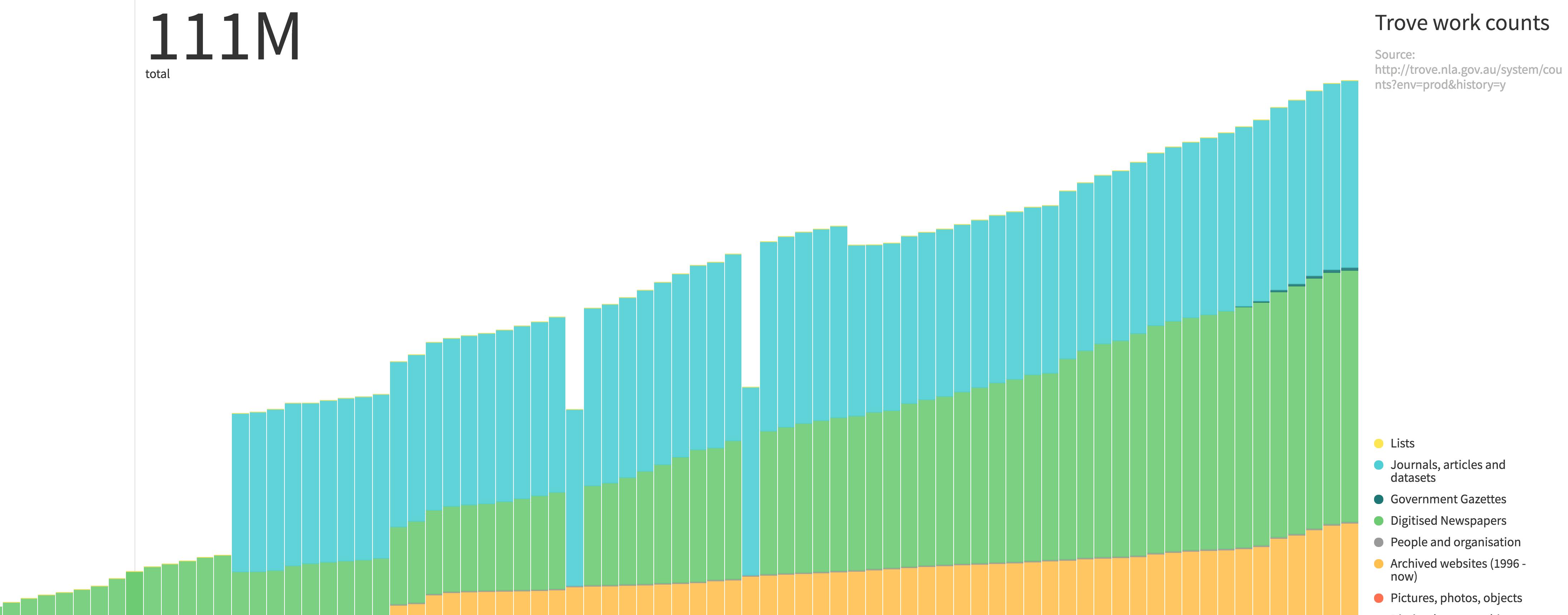
Charted is about as simple as you can get in data visualisation tools. It does one thing, but it does it very nicely. We’ll use it to visualise changes in the contents of Trove:
-
Open up Trove work counts, 2010-2016 and make a copy as before.
-
This time click on the Share button to open the share options.
-
Click Get shareable link.
-
Once the link has been generated click on Copy link.
-
Now go to Charted.
-
Paste the link into the box and click GO.
That’s it! I told you it was easy.
The chart shows steady growth in most parts of Trove, but there are a few oddities. What happened in October 2013? Why did the number of books drop by half in May 2011?
Portfolio alert! So what did happen in May 2011? There’s enough information in the chart for you to present a hypothesis. Write a few sentences in your portfolio.
One nice feature in Charted is the ability to extract one of the traces from the stacked chart and display it separately. Hover over one of the categories in the legend and click on the icon that appears. What happens? Why is this useful?
Charted makes very nice looking charts, but the customisation options are limited. Have a play around. Click on the gear icon to change a few settings. Click on one of the coloured dots to change its color. Try giving you chart a title.
Portfolio alert! And now a challenge – without any more assistance, can you create the same sort of stacked bar chart in Plot.ly? Test your new dataviz skills! Once you’ve recreated the chart in Plot.ly, save it, and then click of the Share button to get a shareable link. Add a screenshot of you chart and the link to your portfolio.
Another way of representing change over time is using a streamgraph – we met streamgraphs in Voyant. Streamgraphs are a bit like stacked bar charts in that that show how the individual strands combine to make the whole, but the visual metaphor they use is that of ‘flow’. They look much more attractive than your average bar chart – is that a good thing or a bad thing?
Raw is a visualisation tool that allows you to create streamgraphs and other less familiar types of charts. Like a lot of visualisation tools, it’s built on top of the D3 javascript library. But whereas you have to be a coder to use D3, anyone can make nice looking visualisations with Raw.
Let’s have another look at that Trove data. This is a case where the tool is expecting to see the data in a particular way, so I’ve had to create a separate spreadsheet – same data, just organised differently.
-
Open up Trove work counts, 2010-2016 – reorganised for stream view. You don’t need to make a copy in this case.
-
Select and copy all of the data.
-
Go to Raw and click on the Use it now! button
-
In the text box just paste the data you copied. Raw will parse the data and let you know that it’s all ok.
-
Scroll down the page and find the ‘Streamgraph’ icon. Click on it.
-
Scroll down to where it says ‘Map your dimensions’.
-
Drag ‘Date’ from the left-hand side to the ‘DATE’ box.
-
Drag ‘Zone’ to ‘GROUP’ and ‘Total’ to ‘SIZE’.
-
Scroll a bit further and you’ll see your streamgraph!
Note that unlike a lot of the tools we’ve been working with, Raw doesn’t offer an easy way to share, or embed the original chart in your web page. You can download your chart as an image, or create the code necessary to render an SVG (Scalar Vector Graphic), which you can then edit in a graphics program or display in a browser.
Try Raw with some of the other datasets. What can you make?
Trees and hierarchies
Sometimes our data represents a hierarchy, or a tree – starting with the complete set and then subdividing into smaller and smaller categories.
Trove (yes Trove again) is divided into zones – like Books, Articles, Pictures. These zones are further subdivided into formats, and subformats. It can be a difficult structure to represent to users. Let’s see if we can use Raw to help.
-
Open up Trove zones. No need to make a copy.
-
Select and copy the data.
-
Open up Raw (or reload the page) and paste the data into the box as before.
-
Select Reingold-Tilford tree from the visualisation types.
-
Drag ‘Zone’, ‘Format’, and ‘Subformat’ – in that order – to the ‘HIERARCHY’ box.
-
View your lovely tree!
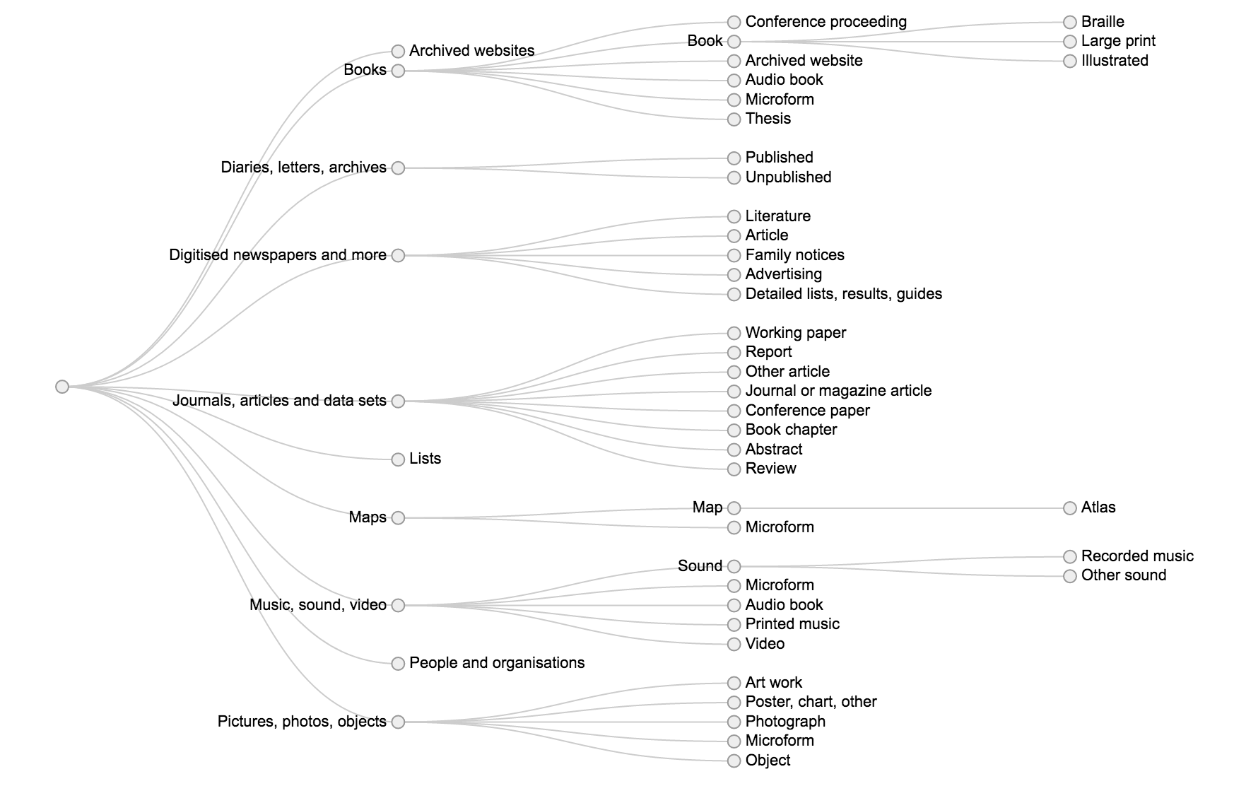
Try this again with the ‘Circular dendrogram’. Which do you prefer and why?
The tree view doesn’t give any sense of how big the zones and their parts are. Let’s try a slightly different approach:
-
Open up Trove zones – with sizes. This is the same hierarchical data, but with information about how many items are in each grouping.
-
Select and copy the data.
-
Open up Raw (or reload the page) and paste the data into the box as before.
-
Select the ‘Circle packing’ visualisation.
-
Drag ‘Zone’, ‘Format’, and ‘Subformat’ – in that order – to the ‘HIERARCHY’ box.
-
Drag ‘Total’ to ‘SIZE’ and ‘Zone’ to ‘COLOR’.
-
View your new visualisation. What do you think? I think it’s rather beautiful.
-
Try clicking and dragging the circles for hours of entertainment!
Here’s another way of visualising Trove’s zones. In this case I used D3 directly to create a ‘sunburst’ visualisation. Try clicking on the segments. What happens?
Network graphs
Network graphs allow you to explore relationships between things (or ‘nodes’ in graph speak). They’re frequently used to visualise social networks – the relationships within a group of people as revealed through activities like correspondence, communication, collaboration. or co-authorship. Martin Grandjean, for example, has used network analysis to explore the nature of the Digital Humanities community by visualising their interactions on Twitter.
I used a network graph to examine clusters in the reasons cited for closing files in the National Archives. I used a tool called Gephi and a tutorial by Martin Grandjean. You can read about it in my research notebook. Here’s what I ended up with:
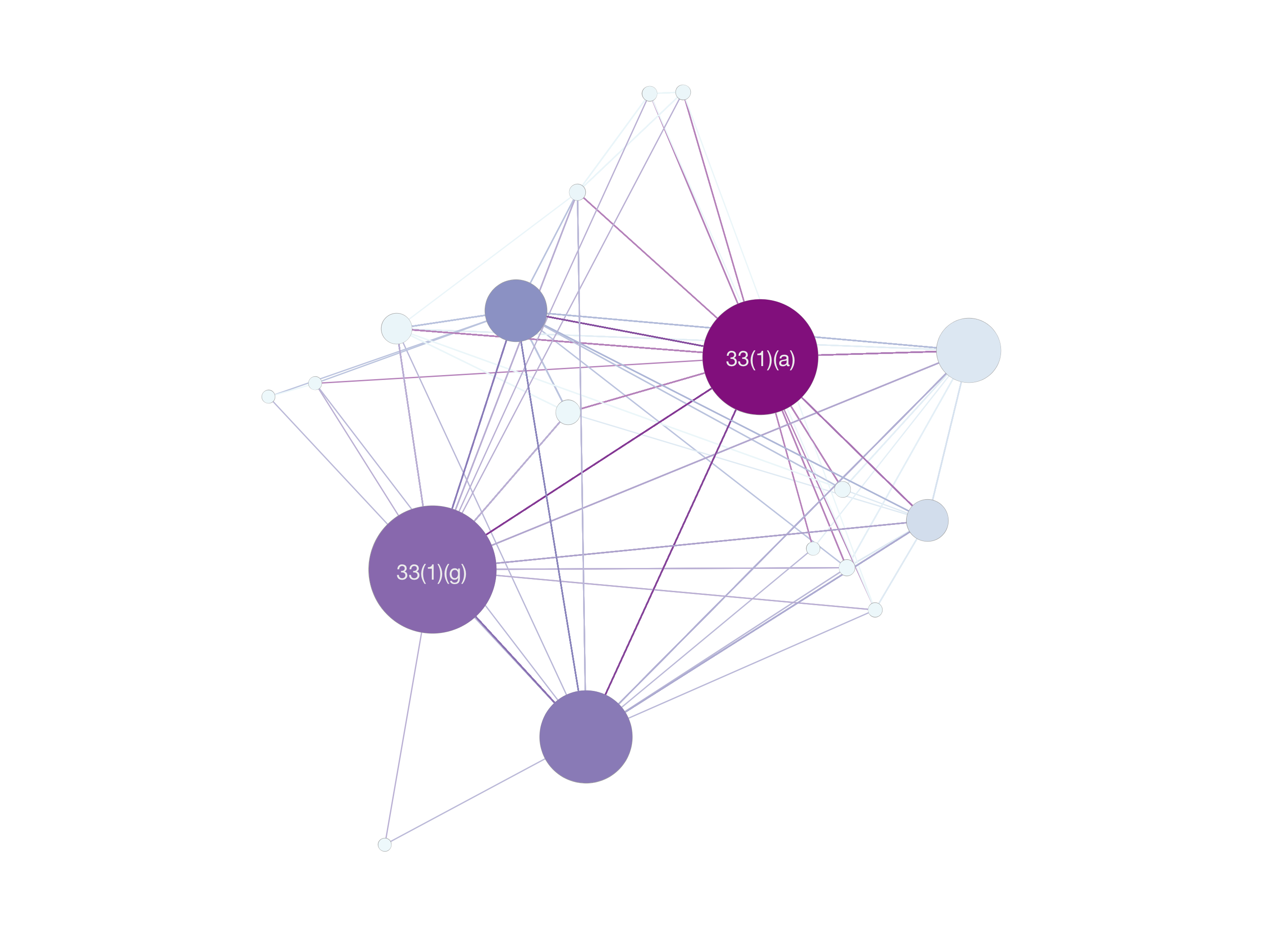
This was interesting because it indicated how commonly the national security exemption (33(1)(a)) has been used in combination with others – it’s sort of the go-to exemption for anything security-ish.
You can create a similar graph using my data and Fusion Tables:
- Open up Reasons for closing files in the NAA and make a copy.
As you can see each row in the spreadsheet is just a pair of reasons, indicating that these reasons have been cited together in an access decision. Unlike a letter sent from one person to another there’s no directionality in this relationship. They just occur together. In some network graphs the direction of the relationships is important and can be visualised.
-
From your Google Drive account click New then More, then choose ‘Fusion Tables’. (Alternatively, go direct to Fusion Tables.)
-
In the ‘Import new table’ box click on ‘Google Spreadsheets’ and select the file you just copied.
-
Click Next and then Finish to complete the data import.
-
Once the table is open, click on the little red + sign and select ‘Add chart’.
-
Fusion tables should recognise that your data can be visualised as a network graph and create one automatically.If not click on the network graph icon (at the bottom on the right-hand side).
-
Use the plus and minus buttons to zoom in and out. Try clicking on a node and dragging it around. What happens? Hover over a node to highlight its relationships.
If you’re interested in network analysis, this tutorial from the Programming Historian provides a good introduction using the tool Palladio.