The power of maps
As I mentioned in class, many years ago now I was involved in a project called Mapping Our Anzacs at the National Archives of Australia. The plan was to build a map interface to 376,000 digitised WWI service records that enabled visitors to find records by the place of birth or enlistment of the service person. To do this I had to extract placenames from the file titles, find the coordinates of the places, and then figure out a way of displaying them on a Google map. We ended up with many thousands of places, and given the limitations of browsers at the time, it wasn’t easy to put them on a map. If you tried to display them all at once everything would slow to a crawl. But still…
I remember the first time I got all those places to display – no fancy interfaces or animations, just thousands of markers obliterating much of Australia. Thousands of places, large and small, that had sent their young people to war. Just seeing those markers crammed in the browser window was a powerful expression of the impact of the war on Australia.
I’ve still got one of the original data files, so you can try this for yourself. You’ll need to install Google Earth. Then just download the anzacs.kml file. Once it’s downloaded, just double click on the file to open it in Google Earth. You might need to navigate your way round the globe to find Australia, once you do, zoom in, and in. You might also like to have a look at the UK.
Even simple maps can tell a powerful story.
Do maps tell the truth?
Here’s a pretty standard map of the world. Have a close look at it and answer one simple question – which is bigger, Australia or Greenland?
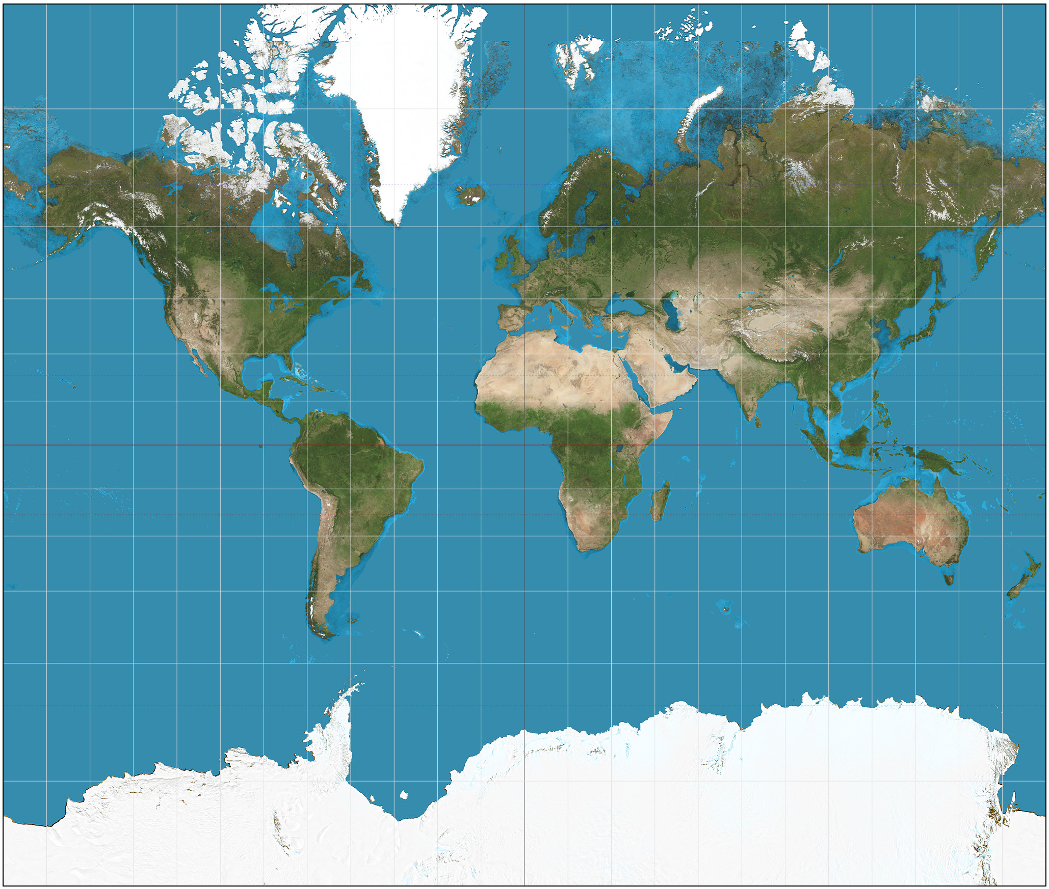
Judging from the map alone you’d think that Greenland was considerably bigger, but it’s not. The land area of Australia is 7,692,024 km2, while Greenland is only 2,166,086 km2 – it’s less that a third the size!
So what’s going on? As you probably know, there’s no simple way of displaying the surface of a globe in two dimensions. In fact cartographers have created many alternative projections, all with their own benefits and limitations. You can browse a list of different projections on the Radical Cartography site (you might need to click on ‘Wall maps of the world’). Note the projections that are labelled ‘Equal area’ – they represent the area of land masses accurately, though the shapes may be distorted.
The projection above is the Mercator projection, created way back in the 16th century to help sailors navigate the world. Despite its distortions, the Mercator projection is still widely used and, most importantly for anyone embarking on a digital mapping project, it forms the basis for just about all online mapping services, such as Google maps.
We put a lot of trust in online mapping applications. We believe them when they tell us to take the next exit on the freeway. We expect them to tell us the ‘truth’, but like other forms of visualisation, there are many assumptions built into the creation of maps. Maps can lie.
You may have seen a story in the media last year about a family in rural Kansas that have been accused of all manner of computer-related crimes. Why? Because investigators on the hunt for spammers and scammers try to find them by geolocating their IP addresses (the network address your computer uses to access the net). But when geolocation services don’t have enough data for a precise fix, they just return an address in the geographic centre of the country – and the centre of the USA just happens to be a farm in Kansas. People just assumed that geolocation services were telling the truth.
So once again we have reason to be sceptical of online services. But once again digital technologies can help us to see things differently, to break free of Mercator’s grid.
The True Size Of… is a fantastic digital project that compares the standard web Mercator projection with the real size of countries. It’s easy and fun to use:
-
Right click on any of the coloured outlines to remove them from the map.
-
Enter ‘Australia’ in the search box.
-
Once the coloured outline appears, drag it towards the north pole. What happens?
-
Try layering Australia over Europe, or over Greenland!
Making simple maps with Google MyMaps
Let’s start off by creating a simple map with Google’s My Maps. You’ll need to have a Google account to create and share maps.
To open up the My Maps editor you can either:
-
go to Google My Maps, and then click Create a New Map;
-
or go to your Google Drive account and choose New > More > Google My Maps.
Add a point to your new map:
-
Click on the marker icon (the cursor will change from a hand to crosshairs)
-
Click anywhere on the map.
-
Add a title and description in the info box. Click save.
Search for a place to add to your map:
-
Type a query in the search box to find a place – try ‘University of Canberra’.
-
The map will recenter and a marker will appear.
-
To add this marker to your map, click ‘Add to map’.
-
Click on the pencil icon to edit the content of the info box. You can also add a photo by clicking on the camera icon.
Try this:
- Draw an area or a line using the polygon tool. What might you use this for?
Add a layer
What if you already have data about places that you want to add to your map? It’s easy to import data from a spreadsheet by creating a new layer. We’re going to create a map of places on the Australian National Heritage List using a dataset from data.gov.au.
-
Download the CSV file.
-
Open up the CSV file and have a look at its contents.
One thing you might notice is that although there are addresses for each site, there are no coordinates – latitudes and longitudes. How will Google Maps know where to put the markers? As you’ll see, Google Maps (and Google’s Fusion Tables) will automatically attempt to turn addresses into coordinates. This process is known as geocoding or geolocation. We’ll talk more about this below.
-
In the My Maps editor click Add layer. A new layer will appear in the dialogue box.
-
Click Import under your new layer.
-
Select and upload the heritage places CSV file.
-
You’ll then be asked to choose the fields that will enable Google to position your markers. Scroll down the list and check ‘address’. If you want to see an example of the contents of each field, just click on the little question mark.
-
Click Continue.
-
Now you need to select the field that contains the titles of your markers. Check ‘name’.
-
Click Finish.
Yay! A map appears with lots of little markers. Try clicking on the markers. Zoom in to see things more clearly.
But wait a minute – you might have noticed that there’s a message in the layer details saying that some of the places couldn’t be located. Oh no!
-
Click on the Open data table link under the warning to see what the problem is.
-
At the top of the table you should see a number of rows highlighted in red. For some reason the
addressfield didn’t provide enough information. -
Find the row for ‘Mawsons Huts’. You’ll see that the
addresshas ‘EXT’ instead of a state (presumably meaning ‘external territory’). -
Click on the
addressfield and change the ‘EXT’ to ‘Antarctica’. Hit enter. What happens?
See if you can find any other obvious problems and correct them. If we were doing this properly we’d obviously want to make sure that all our places appeared on the map.
-
Close the data table.
-
Let’s try styling our map a bit to show some more information. Click Uniform style in the heritage places layer.
-
In the ‘Group places by’ dropdown list choose ‘class’. You’ll see the markers will now have different colours representing the three classes – ‘Historic’, ‘Natural’, and ‘Indigenous’.
This is a simple example of how maps can represent not only locations, but data relating to those locations. My Maps abilities to display data are limited, so for more complex datasets you’re probably better off using something like Carto (see below).
There are other limitations as well. This is a map of bus stops in Canberra. I’ve just imported a dataset provided by the ACT Government. But something’s not right… Can you see a problem?
It seems that large areas of Canberra have no bus stops! Why? It’s just because My Maps will only display 2000 points at a time. Once again – beware of what online services hide!
Like the charts and visualisations we saw last week, Google’s maps can be easily shared and embedded. Click on Share to change who can see your map and create a public link. Click on the three little dots next to the map’s title to find the embed and export options.
Portfolio alert! Share your map and save the public link in your portfolio.
Geocoding options
Depending on the source of your data you may or may not have coordinates for the places you want to map. As we saw, My Maps (and Fusion Tables) will automatically try to geolocate address data. However, there doesn’t seem to be any way of getting the geolocated data back out of Google.
There are a large number of geolocation services about – most are commercial, though some will offer a free or trial service that will allow you to locate a limited number of points. Mappify is an Australian service that seems to offer a reasonable free allowance. Carto, which we’ll explore below, only lets you geocode 100 points a month before you have to start paying.
If you’re willing to make use of geocoding APIs there are more options available. You might have noticed that the OpenRefine tutorial we worked on a few weeks back includes a section on geocoding data. There’s also a wholly free and open source geocoding API called Nominatim made available by the Open Street Map community.
Maps and data
Increasingly maps are presented as ways of exploring complex datasets. Have a look at the series of maps created by the American Panorama project, such as The Forced Migration of Enslaved Peoples. Examine the types of data being presented and the way the different visualisations interact.
Another interesting example of data-driven maps is Orbis. This is an attempt to represent the experience of travel in the world of Ancient Rome. By adjusting the settings you can see how this experience changed depending on how much money you had, the transport options available, even the time of year. In this case the data is not really obvious, but clearly the map is based on much detailed research.
For more examples, ideas and inspiration have a browse through the Carto gallery.
Portfolio alert! Select a map from American Panorama and analyse it – exercise the critical skills we discussed in the last module. In a minimum of 200 words explain what it shows, what it hides, and what you learnt from it.
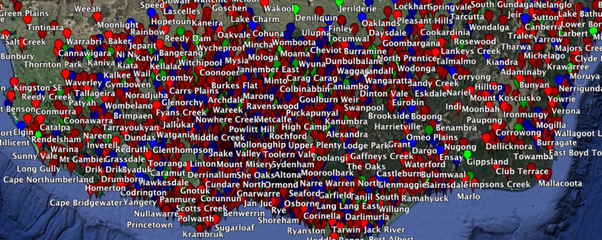
Mapping Trove newspapers
Google MyMaps is ok for simple maps, but there are a number of other online tools that enable you to create complex visualisations. The American Panorama series were created using a popular online mapping service called Carto. We can create something like their multi-faceted map visualisations using Carto and some data harvested from Trove.
The Poon Gooey family were amongst those who lived under the restrictions of the White Australia Policy. If you’d like to find out more about Poon Gooey and his wife Ham Hop, have a browse of Kate Bagnall’s blog. Their case attracted quite a lot of attention, as you can see on Trove. I’ve used my Trove Harvester to download details of all newspaper articles including the phrase ‘Poon Gooey’. We’re going to try mapping this data.
To complete this activity you’ll need an account with Carto. They have a basic free account that includes everything you need to get started. You can sign up using your GitHub account.
-
Once you’re logged into Carto, click on the Datasets link in the top navigation bar.
-
Click on the blue New Dataset button.
-
Copy and paste the following link to the harvested Trove results into the url input box and click on Submit.
https://dl.dropbox.com/s/miy0rg62l7e1eg9/results.csv
-
From the Connect dataset page click on the blue Browse button and select the
results.csvfile you downloaded from DHBox. -
Click on the blue Connect dataset button at the bottom of the page.
-
Carto will import the file and open it for editing.
At this point you may be wondering what we’re going to map, after all, there isn’t any geospatial data in the results from Trove. Ah ha! It just so happens that I did a little tinkering late last year to extract place names from newspaper titles and create a map interface to Trove. I also shared the CSV file that links newspapers on Trove to geolocated places.
-
Click on the circle thingy in the top left corner of the screen to go back to your datasets.
-
Click on the New dataset button again.
-
This time, copy and paste the following link into the url input box and click on Submit.
https://dl.dropbox.com/s/a0jj1lepbcrtz9h/trove-newspaper-titles-locations.csv
- Now click on the blue Connect dataset button to load the new dataset.
All our data is now ready and we can start to visualise it!
- Click on the blue Create map button at the bottom of the dataset editing page.
Your map will open showing all the locations where newspapers were published. To limit this to only those titles included in our harvester results we need to join the two datasets.
-
Click on the current dataset in the left hand menu.
-
Click on the Analysis tab, and then the blue Add analysis button.
-
Select the Join columns from 2nd layer option and click on yet another Add analysis button.
-
In the box that says TARGET choose the
resultsfile from the harvester. -
Now you have to identify the field that links the two files. Under Key Columns choose
title_idfrom the SOURCE COLUMN (our locations data, andnewspaper_idfrom the TARGET COLUMN (our Trove results). -
Finally we select the fields from each dataset that we want to appear in the joined dataset. Under Output data select
stateandplacefrom SOURCE DATA. From TARGET DATA selecttitle,newspaper_title,date,page, andurl. -
Click on the Apply button.
You should notice that some of the markers on the map disappear as the files are joined. This is what we’d expect – now we’re just seeing those places where articles in our harvest were published. If you don’t see anything, trying zooming and panning the map until it’s centred on Victoria.
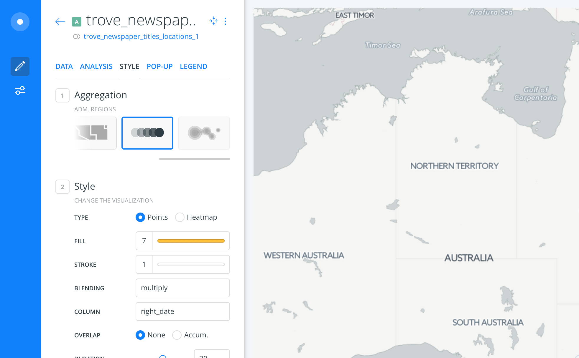
Now it’s time to style our map. I’m going to focus on creating an animated map that shows when articles were published, but feel free to play around with the other styles.
- Click on the Style tab. Under Aggregation choose the Animated style – it looks like a moving dot.
-
Set the Blending value to ‘multiply’.
-
Set the Column to
right_date– this tells Carto which field to use as the timeline for the animation.
That’s it. A timeline will appear below the map – just click on the play button to start the animation if it isn’t running already.
That’s pretty cool, but Carto also makes it easy to add some mini visualisations – called widgets – that we can use to filter the map results.
-
Click on the Data tab.
-
Check the boxes next to
state,place, andright_newspaper_title. If the widgets don’t appear, try resizing your window. -
Click on the Edit links next to the widget names to edit settings, including their titles.
If you’re pleased with your map you can share it with the world.
-
Click on the settings icon in the blue left hand bar.
-
Click on the blue Share button, and then the Publish button.
-
Grab a copy of the link to your map from the Get the link box. Share!
You can also embed you map in another website. Here’s one of the Poon Gooey articles that I created earlier.
Georectifying maps
So far the base maps we’ve been using are just the standard modern web maps we use every day. But if we’re using historical data we might want to position our markers on a historical map. There are plenty of historical maps around, the problem is their coordinates might not match those of modern geospatial systems. The way we get around this is by georectification. Put simply, we match known points between the historical maps and modern maps and then distort or align the historical maps so that they can be used with modern geospatial systems.
Have a look at the NYPL Map Warper to browse a large collection of georectified historical maps.
We’re going to make use of a public version of the NYPL Map Warper tool to georectify some Australian maps.
-
Go to MapWarper
-
We’re going to georectify this 1856 map of Melbourne.
-
Click through to the digitised version and then click on the ‘Download’ icon.
-
This map is available as a high resolution tif. This would be the best version to use as it would allow us to zoom right in. But it’s 112mb, so to speed things up let’s use the jpg for now. Select the ‘JPG’ option and click Start download. You’ll need to unzip the downloaded file.
-
Go to MapWarper, login and click on the ‘Upload Map’ tab.
-
Copy the basic bibliographic details from Trove to the MapWarper form – title, publisher, date etc.
-
Click on Choose file button to select the map we just downloaded.
-
Once the form is complete, click on Create.
-
Once the map has loaded click on the ‘Rectify’ tab. You’ll see the map you loaded on one side, and a modern map on the other.
-
Pan and zoom the modern map until you’ve found the location of your historical map.
-
Now the fun begins! Identify points that you can see on both maps (such as the corners of streets).
-
Click on the pencil icon to ‘Add a control point’ to your historical map. Just click on the map at the point you identified.
-
Repeat this process for the modern map.
-
Once you’re satisfied that you’ve identified a pair of matching points, click the Add Control Point.
-
Repeat this at least three times with additional points.
-
Once you’ve added your points, click the Warp image! button.
-
Once it’s done, click on the ‘Preview’ tab to view the results!
Now that you’ve got the idea, find your own historical map and follow the same process to georectify it. Here’s a few searches that will help you find good quality digitised maps in Trove:
Portfolio alert! Once you’ve georectified your own historical map, save a screen capture of the preview and a link to the map on MapWarper in your portfolio.
How might you use these georectified maps? In the bottom left hand corner of your Carto maps you might have noticed an option to change the basemap. We can use this to set our historical data upon a historical map!
Telling stories and mapping uncertainty
Neatline is a mapping and visualisation tool that works with Omeka. It enables you to incorporate a range of sources, and use maps to tell complex and uncertain stories. See their demos for some fascinating examples of what’s possible.
There are a number of other tools available that enable you to create complex narratives using maps:
You can even use your georectified maps in StoryMap to narrate a journey around a historical region! In fact the base layers in StoryMap don’t even need to be maps – you can construct a story that traverses any high-resolution digital image, such as a painting.